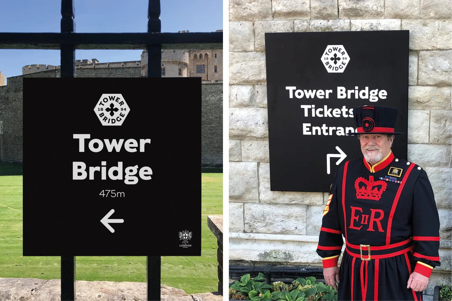
Tower Bridge
Guiding visitors to, and around, one of London’s biggest attractions
Helping visitors find their way from the Tower of London to the ticket office at Tower Bridge was just one of the challenges in front of us when we embarked on creating a new wayfinding system around London’s defining landmark.
Although 800,000 people go through the doors of Tower Bridge every year, many more do not realise you can actually enter the Bridge to experience spectacular panoramic views and the exciting glass floor over the Thames, whilst discovering the stories behind the Bridge, and the people that built.
From Tower Hill, and the Tower of London, to Shad Thames, on the south of the Thames, the new system covered an enormous area. It had work hard to make it clear that people can visit the inside of the Bridge, guide them to the ticket office, and then also help them along their journey, linking the different parts of the visitor attraction to ensure there is no ‘drop-off’.
Signs, some as far away as 500 metres, guide people along a route and the decreasing distance shown gives reassurance that they are on the right path - getting closer to their eventual destination.
Minimum disruption to the iconic Grade 1 listed building was essential, which meant careful consultation with the client. Following an audit and review of the visitor journey, ineffective signs were removed as we set to de-clutter and bring renewed clarity. By helping the visitor flow the new signs connect the pieces of the Tower Bridge story, and improve the experience for all.
Our approach to wayfinding strategy is based on research, design principles and focused on the end-user.
1. Avoid choice overload (don’t give the user too many choices in navigation).
2. Display the distance, reassuring visitors they are getting closer to their eventual destination.
3. Signs are placed at strategic decision points.
4. Where possible, use sight lines allowing visitors to see what is ahead (and their final destination).
5. Clear branding, and colour coded.


